(Source: Flickr)
Introduction: Everyone wants their restaurant to look good, regardless of the style and concept of the establishment. But whether you have an upscale French bistro, a modern sushi bar, or a rustic farm to table restaurant, there are certain restaurant decor trends that have become ubiquitous to the point of cliché, and should perhaps be avoided if you want to maintain a unique look.
Some of these trends are bad ideas to follow because they look dated quickly or can make your restaurant look cookie-cutter; others should be avoided for functional reasons, and can keep your restaurant from providing a great experience. View the list and see for yourself which trends your restaurant should steer clear of, and you might save yourself a huge hassle in the future.
How will you know which trends you should avoid? No, this list isn’t meant as a “must avoid at all times” list; it’s impossible to say what decor should unequivocally be avoided in any and all restaurants. This list is meant to spotlight trends that may have a past-due date that is coming up very soon. Review this list with your restaurant in mind; while certain trends might be quite timeless in your particular restaurant, others might appear dated before too long.
10 Restaurant Decor Clichés to Avoid. Let’s delve right in: these are the restaurant decor clichés that you should think twice about and why.
(Source: Flickr)
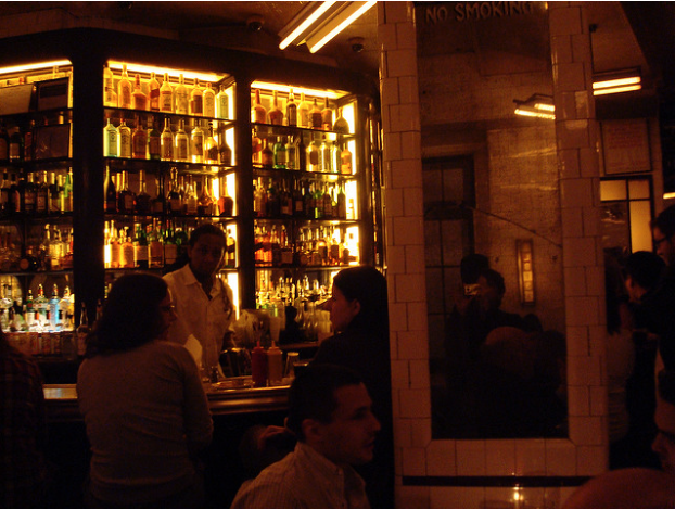
- All-over tile. It’s very trendy these days for restaurant walls to feature all-over tile. While subway-style tiles look cool and pinterest-worthy on the wall and floor, they have an annoying side effect: they don’t absorb any sound. This means that your restaurant will sound bustling if there are more than five tables being seated. If you are going for the trendy, see and be seen vibe, perhaps this is desirable. However, if you want to create a casual spot where people can conduct business or have romantic dates, you might not hit that mark with this aesthetic decision which could keep people from hearing each other while dining.
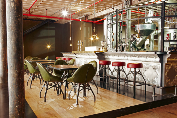
- Cool-looking, but uncomfortable, chairs. Sure, modern metal chairs or cool-looking stools might make your dining room look picture-perfect. But when it comes to customers sitting in these chairs, there’s no comfort to be offered. Some restaurant owners look at this as a benefit, and a way to keep tables moving. However, consider the customer’s comfort before settling on a cool but non functional seating choice. Your customers are spending good money in your establishment, and deserve to dine in comfort.
- Communal tables. Here’s a controversial trend which has slowly but surely taken over the restaurant world: the communal table. Fans say it’s a great way to start conversations and create community; detractors say it’s annoying and keeps them from connecting with the people they are dining out with. There are good points on either side of the argument.
The best advice is to strongly consider whether or not communal tables are right for your restaurant. Consider how this style of dining might work in your community, and if this is the casual vibe you want to set off, or if you prefer to give people space to have a private dining experience. 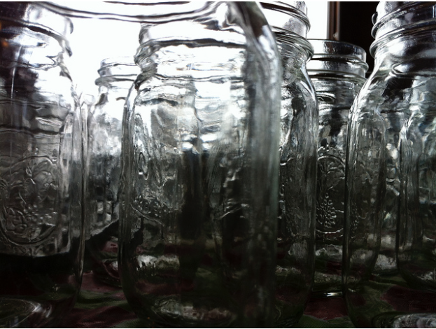 (Source: Flickr)
- Ubiquitous mason jars. Mason jars have taken over restaurants, and not just to store preserves. On any given day at a restaurant, you might see mason jars used as beverage vessels, lamp elements, cutlery holders, small table vases, or even serving vessels for appetizers or desserts. In some settings, the mason jar use works, but it’s quickly becoming overdone, so give it a long hard think before you invest in several pallets of mason jars for your restaurant.
- Plates that don’t make sense. Beware the cool-looking plate. While asymmetrical or unusually-shaped dishware might look neat, it’s not always functional. It can be a pain to stack in the kitchen, can shatter in the dishwasher, and some creatively shaped plates can tend to leak as servers deliver food. When it comes to plates and cups, consider function as strongly as you consider form. Consider how many plates will fit on the tables, how easy they are to store, and how well they work for the food you are serving.
- Too-close seating. It can be tempting to pack customers in like sardines–the more people you can fit in your restaurant, the more money you can make, right? Well, maybe not. Seating your customers too close to one another robs customers of a pleasant restaurant experience, makes them feel claustrophobic, causes employees to jostle diners and each other, giving off the air of being amateur and not properly trained. Ultimately, it might cause customers to rethink your restaurant. Is it worth it?
- Unwieldy menus. So you think it’s a cool idea to print your menu on drift board? Well, perhaps it looks cool, but if nobody can read that wood grain embossing, then it wasn’t such a great choice. Give it some thought before you commit to an unconventional menu. Not only will it annoy diners who need readers to peruse the menu, but it’s difficult to make changes to your menu on the fly. Try to choose a menu format that is easy to read, accessible, and allows you to make changes.
 (Source: Flickr)
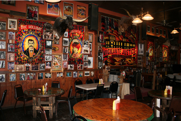
- Meaningless memorabilia. Using meaningful objects to decorate your restaurant space? Cool. Using weird objects without meaning to garnish your walls? Not so cool. Meaningless memorabilia isn’t going to do anything for your walls except confuse diners and make the restaurant seem cluttered. So rather than raiding the Goodwill for hipster-approved ironic decor, be sure to decorate in a way that is thoughtful and meaningful to you.
- Edison lightbulbs. Edison-style exposed light bulbs have multiplied in the restaurant-sphere at such an alarming rate that the trend is bound to crash and burn sooner or later.
Sure, they look nifty now, but how will they look in five years? It might be a better idea to invest in a more timeless lighting solution rather than having to wait another hundred years for the bulbs to come back into fashion again.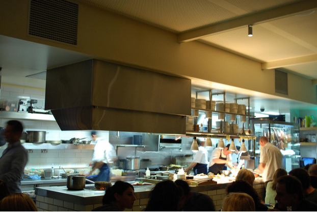 (Source: Flickr)
- Exposed kitchen. Ah, the exposed kitchen. It’s very hot right now, and there’s good reason why. An exposed kitchen is very much in-line with consumer demand for transparency from food providers, and it allows a unique view into the inner workings of a kitchen.
The problem? Sometimes the kitchen staff doesn’t want to be watched with an eagle eye. Not because of their shady kitchen practices, but because being watched can make them self conscious about doing the work they are there to perform, and because they can feel under scrutiny when they make a mistake. Plus, the commotion of a kitchen, with clanging pots, smoking stovetops, and perhaps even cursing chefs, isn’t always the most appetizing view for diners!
Conclusion: There are not hard and fast rules about what you can and cannot do with the decor of your restaurant. However, it’s worth taking the time to consider decor trends which have become cliché. Is it worth taking the time, energy, and money to outfit your restaurant in a way that will become tired and dated in the not too distant future?
Which restaurant decor clichés do you think should be avoided?


