Photo Courtesy of Flickr Creative Commons
In a digital age, a website is necessary for practically every business, but for a restaurant, it’s crucial. Potential diners will check you out online before visiting to see what your menu is like, your hours, or your location.
While having a website is a must, it’s also important to consider the experience of the customer visiting your site. If it’s not easy to find what they’re looking for, you can lose potential customers left and right. Read on to learn how to create the best website you can to increase business and keep customers happy.
What Are Customers Looking For? Before you set out to create a website for your restaurant, it’s important to understand what you’re trying to accomplish. Think about it from your perspective. When you want to try out a new restaurant, what do you want to know? Likely, it’s only a few things, and the rest is secondary.
You want to include your menu, of course, and your location. You also need to include directions — even though most people can probably plug the address in their GPS, not everyone can, and you don’t want to lose a potential customer because you didn’t provide basic information. Hours of operation, and maybe some photographs are a nice touch, but other than that, everything else is optional.

Photo Courtesy of Flickr Creative Commons
Hire a Professional. Unless you have the skills and ability to build a website, it’s best to hire a professional. Even though there are many services that enable the technophobic to create a website themselves, many of these services look amateurish and unprofessional. Someone that knows what they are doing can take your brand and create something that really resonates with your customers. Consider your website an essential marketing tool, and budget accordingly.
Keep it Simple. Some restaurant websites have flashy intros with moving graphics and music that begins playing as soon as you load the page. Unless your place is in a Vegas casino, you don’t need these features. In fact, many people are turned off by what can be considered obstacles to get to the information they want. You’re not trying to get people to visit your website and stay for a while like a blog or social media site, so don’t make it difficult for someone to find what they are looking for.
Other things to skip include ads for other services (like Google ads) and automatic playing videos. It’s fine if you have an awesome video of your chef at work in the kitchen, but leave it to diners to decide if they want to see it. For the most part, your average site visitor is looking for certain information, and isn’t looking for entertainment from a business website. Being too forceful can definitely be a turnoff and will turn customers away.
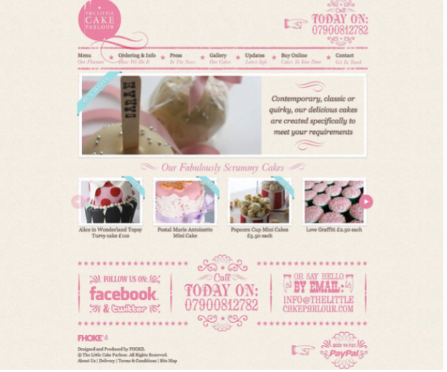
If you have social media pages, have small buttons that visitors can use, but don’t make them obtrusive. Begging for Facebook or Twitter followers can look desperate or needy, especially if you don’t really have anything to say on those pages.

Photo Courtesy of Flickr Creative Commons
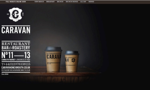
Put Contact Information Front and Center. If someone has a question about your restaurant, you want them to be able to contact you immediately. For this reason, it’s important to make your contact information — address, hours, and phone number — easy to find on the front page. In addition, you should have a contact page where customers can send you a message through your site. This is important, as this is where your customers will likely send praise or criticism or other comments. Not only is it important to include a contact page, but it’s equally important that you know where these messages can be found and that you answer them within a reasonable amount of time.

Photo Courtesy of Flickr Creative Commons
Keep it Short. You should definitely have a description of your restaurant, and maybe a bio of your head chef, but these do not need to be long, and they certainly don’t need to the focus of your site. The vast majority of your customers can learn everything they need to know from your menu, so make that the center of attention, and easy to find.
Keep everything brief — most customers won’t read paragraph after paragraph detailing how you got into business and aren’t interested in the day to day operation of your business. If you get requests for more of this type of information, consider starting a blog, but don’t bury sought after information in page after page of text.
Pay Attention to Visuals. Visitors to your site will likely not have tons of time to spend looking around. Maybe they’re looking to see what sounds good for dinner, or maybe they’re just trying to see when you’re open. Either way, it should be easy to find what they are looking for. Your color scheme and font should be easy on the eyes, and photos should be clear, high-quality, and not in the way. If you’re going to include a lot of photos, have a professional take photos of your food and staff, and then use these as accents instead of the main draw.

Photo Courtesy of Flickr Creative Commons
Update Often. Many restaurant operators put up a website because they were told it was necessary, but then don’t really think about it again. This is a mistake, and one that can cost you.
Updating your site, answering inquiries, and keeping it fresh are important, especially when it comes to the menu or any major changes you’ve made to your business. The last thing you want is a diner visiting the restaurant looking forward to a dish that you no longer serve; there’s a good chance nothing will make them happy at that point. Other things to keep up to date include changes in your hours (many people will not visit again if you’re not open when promised — even if you’ve changed your hours), a new location, payment (for example you no longer accept credit cards) or renovations. Whenever you make a major change, it’s important to update your site. You don’t necessarily have to update daily to include things like specials, but it shouldn’t ever look like it’s been awhile since your last update.
It’s a good idea to visit your website as guest would every so often so that you can see if links are broken, photos aren’t showing up like they should, or just keep everything fresh looking.
A website is an essential marketing tool in this day and age, but there’s more to it than just slapping up site and then forgetting it’s there. A well thought out design, regular updates, and the right information front and center can all go a long way to creating a website that will work for you rather than against you.
Do you have a website for your business? If so, tell us about it!


