Photo Courtesy of Flickr Creative Commons
Creating your menu can be one of the most fun and exciting parts of opening your restaurant. While you may think your actual menu is not important, you can hurt your business by not putting some thought into how your guests will see it. Read on to learn what mistakes you may be making without realizing it.
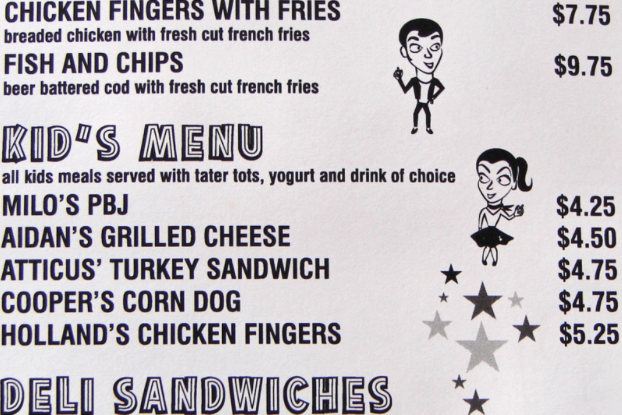
Too Many Items. When creating your menu, the first thing you might want to do is list every single outstanding dish you can make and add it to the menu. While it’s okay to create a long list, you need to pare it down considerably before adding everything to your menu. This is good for both your kitchen and your customers.
As a chef, your best dishes are those that are made over and over again. Having a menu with dozens of options means you’ll be preparing dozens of options everyday. You’ll also have to stock ingredients for every dish, which takes up valuable kitchen space, as well as increases food waste.
From a customer standpoint, it may seem like the more choices, the better, when in fact, too many options can be overwhelming. It also slows down your dining room while diners spend time looking over the menu.
Instead, come up with a few choices that you know you can knock out of the park every time. You can offer specials to change it up a bit, but a few really good items is better than a menu full of mediocre options.

Photo Courtesy of Flickr Creative Commons
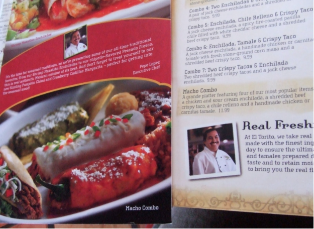
Bad Photography. Photography on a menu is a highly debated topic among restaurant owners, with many seeing it as a bad idea. There’s nothing to say that you can’t add photos to your menu, especially if your food is beautiful, but make sure that the photos make your food showcase your food in positive light.
Food photography is one of the hardest forms of photography, in part because a lot of food simply doesn’t look good, but also because it has to make someone want to eat it. If you insist on putting photos on your menu, take an objective look at them and ask if they make your mouth water. Ask other people the same thing. If you don’t get an overwhelming positive response, do not put them on your menu or anywhere in your restaurant. It’s better to have no photos than bad ones.
In addition, if you put other photos on your menu (photo of the owners, for example) make sure that the photo is good, not distracting, and offers something positive to your customers.

Photo Courtesy of Flickr Creative Commons
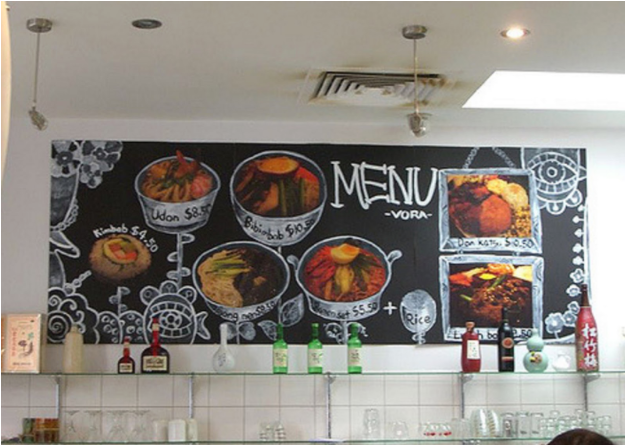
Hard to Read Font or Clashing Colors. Your menu should be easy to read by everyone that comes in your door. No matter how much you may love a certain script font or old school handwritten look, if it’s not easy to read without a question, try something else. If the majority of your diners are senior citizens, having a tiny print will do you no good.
In addition, choose colors that compliment each other, but are easy to read. Yellow text on a white background is not ideal, for example.
Bad Layout. If you put your main courses at the top or front of your menu, customers may ignore appetizers. You want to have a layout and order that makes sense — like items grouped together and in the order that most people would order them. Poor organization and layout just confuses people and causes them to not order dishes they may have.
Too Many Additions. While you want to have a few “upsell” items, like adding bacon to a burger, or protein to a salad, too many of these gets confusing and seems like your goal is nothing but making money. It’s common to have special sides that cost extra money, but limit yourself to only one or two, and make sure guests can see what makes one side worth more. Lobster mashed potatoes are definitely worth another dollar over regular, whereas sweet potato fries vs. traditional may not be seen the same way.

Photo Courtesy of Flickr Creative Commons
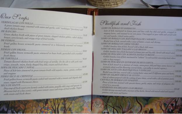
Poor Descriptions. A good menu is one in which every single item sounds so appetizing that diners can’t decide what to order. When writing descriptions, use words that appeal to the senses, such as “crunchy,” “creamy,” or “spicy” rather than “delicious,” or “tasty.” You want to paint a picture of what they are getting, and “tastes good” should be implied.
Descriptions should also be short and to the point, yet you should mention the main or questionable ingredients, including major allergens. If your dish seems like it might be vegetarian (such as a salad,) but includes something like bacon, make sure to mention it.
If your restaurant is ethnic and you serve a lot of uncommon foods, you’ll save a lot of frustration by giving brief definitions of foods diners may not have heard of.

Photo Courtesy of Flickr Creative Commons
Pricing Mistakes. Pricing is one of the most difficult parts of creating a menu, but doing it wrong can have dire consequences. Unless you own an extremely upscale establishment where the majority of your guests don’t care about price, always put the price of everything on your menu, including specials. Your prices should not be so far apart that guests automatically choose the least expensive menu item, and the prices should not be the focal point of the menu.
Not Offering Something For Everybody. Yes, we talked about not having too many choices, and while that’s true, you need to take in account how people eat. If you’re in a trendy area, you’ll likely want to have a couple gluten free options, and in most places, at least one vegetarian choice is a must. Don’t go crazy — you truly can’t please everyone — but you want to be able to offer most people at least something they can order. The keyword there is most — the diner that only eats a raw, macrobiotic diet probably has difficulty just about everywhere.
A well thought out menu is one that is clear, easy to read, and leaves a diner with few questions. While it can be easy to make mistakes, creating the perfect menu is simple and effective.
Have you made any of these mistakes on your menu?


